
This week I wanted to give my go at some simple minimal designs, with the caveat that I wanted to create depth with minimal color and what are the ways I could do that. All these designs revolve around circles and how they interact with one another.
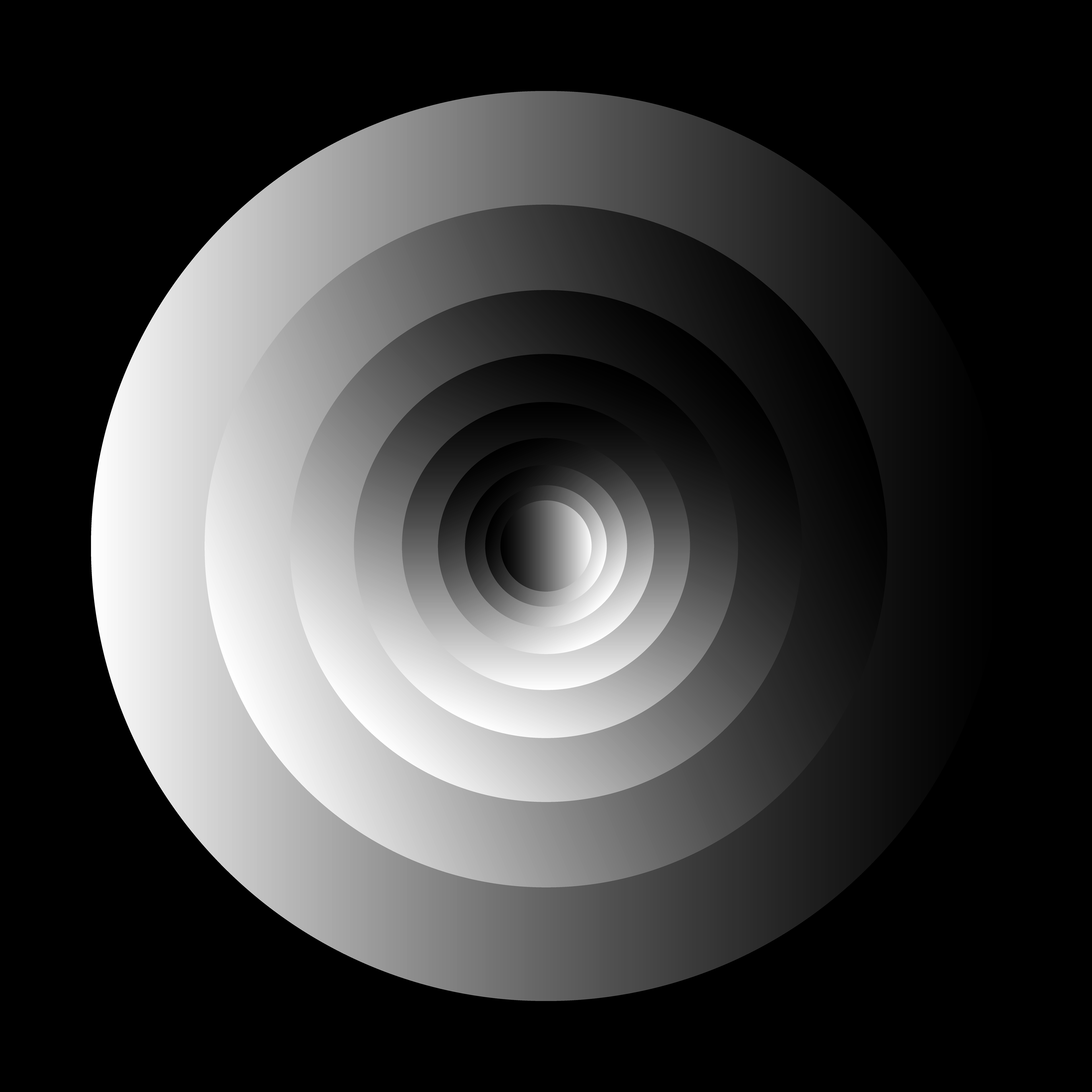
The first image is a kin to the Packers Cut Out project I did where there is a perceived depth with the circles gradually getting smaller. The circles are 75% the size of the circle that is on top of, and that gets this sort of exponential down scaling effect. I then messed around with gradients on the circles. Where all the circles have the same gradient and each circle as it gets smaller is rotated 22.5° until the inner circle is the opposite of the outside circle.
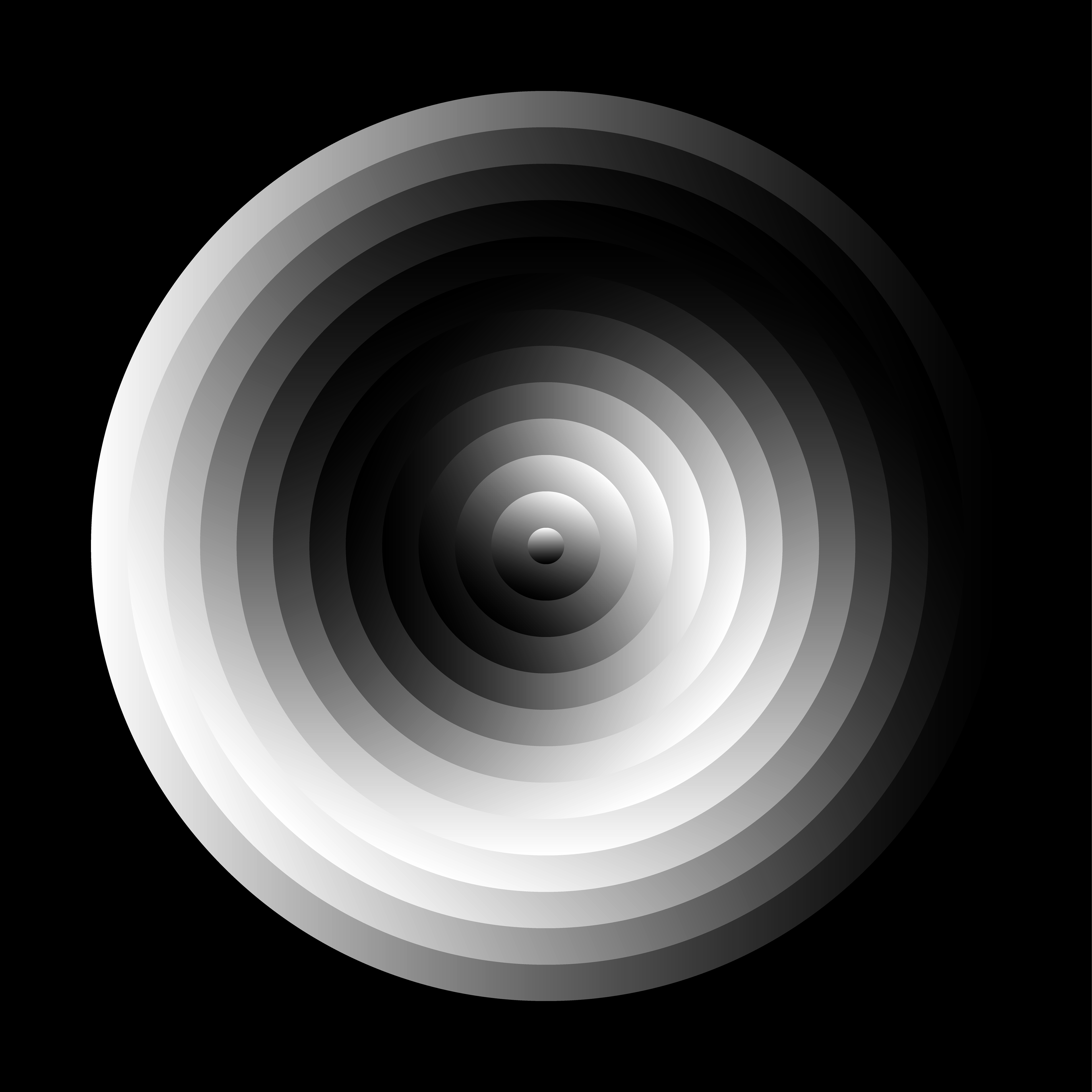
The second image is building off the first image, but this time the circles are getting smaller at consistent 72px rate. Then there is the same gradient rotation as the first, and this time it gives it more of a yin yang symbol look.
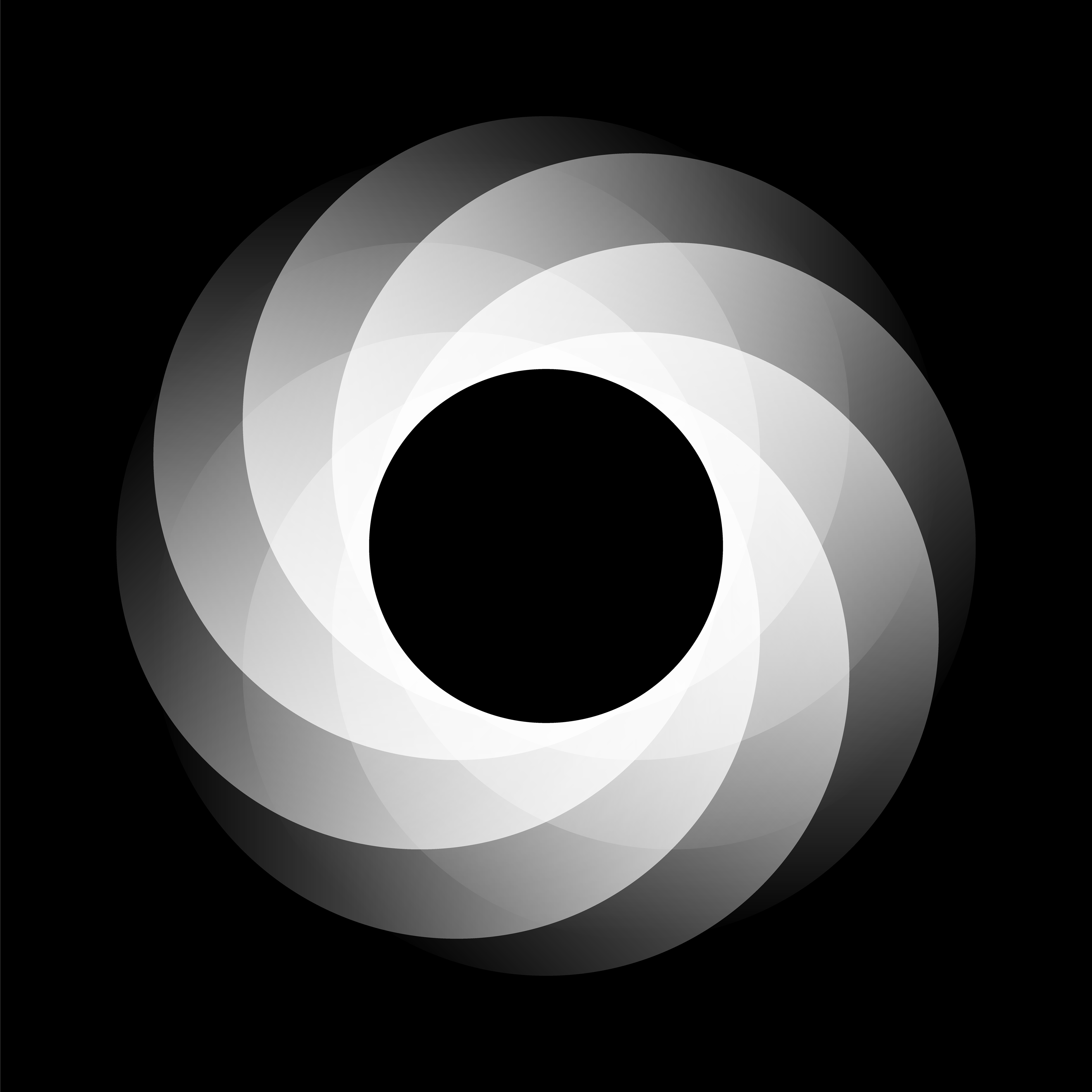
The third image is a rotation of a circle about the outside edge of the inner circle. This gives this camera iris effect as if the shape is closing in on itself. There is a gradient that fades out and that is in line with the rotation of the circle so there is a constant fade on the outside of the shape.
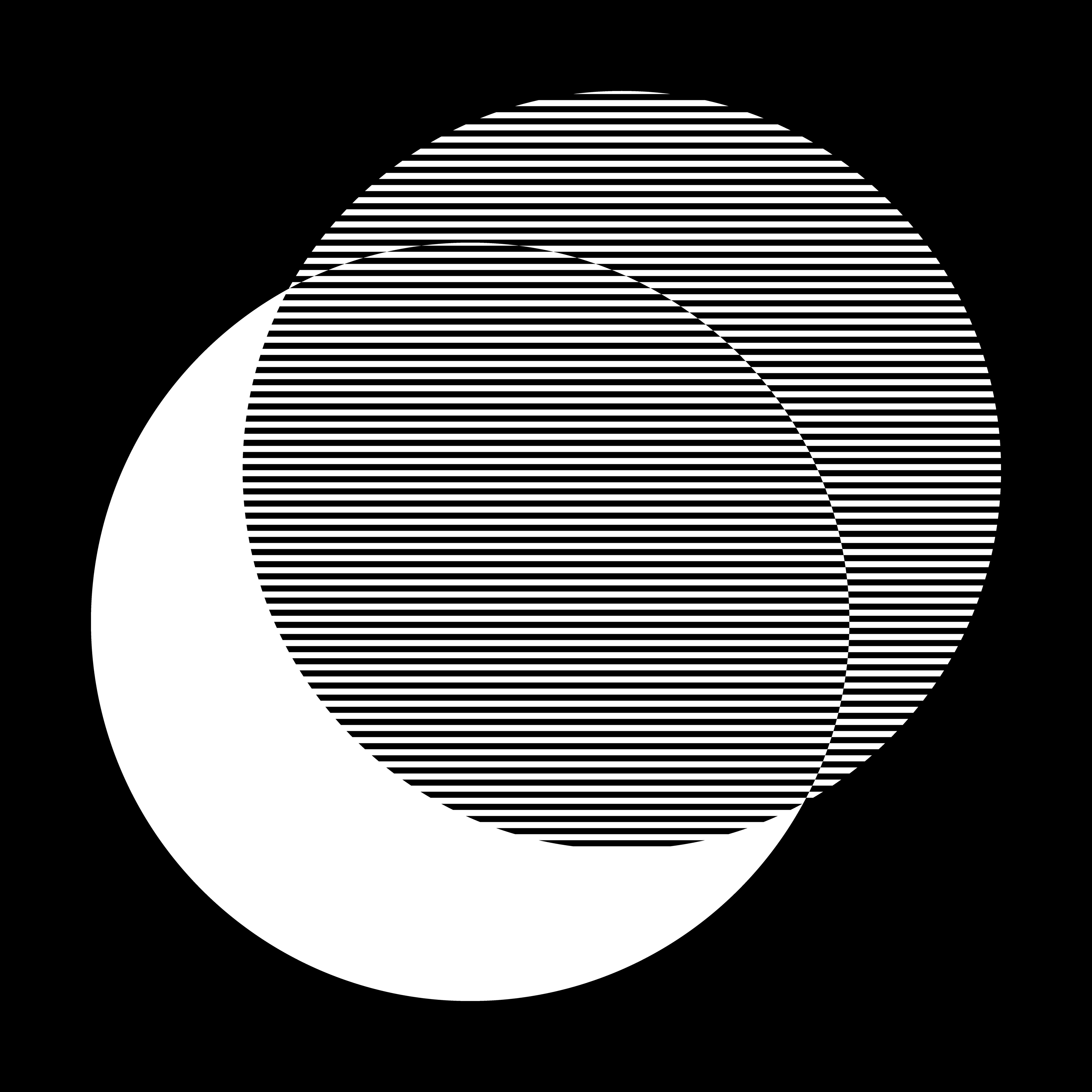
Then the fourth image is completely different whee I wanted to mess with lines instead of gradients. Where the top circle is filled with this hatched pattern, but where the two circles over lap the pattern shifts up/down one row. So at the intersection of the outline it is either black/white or white/black instead of a consistent line across the shape.