
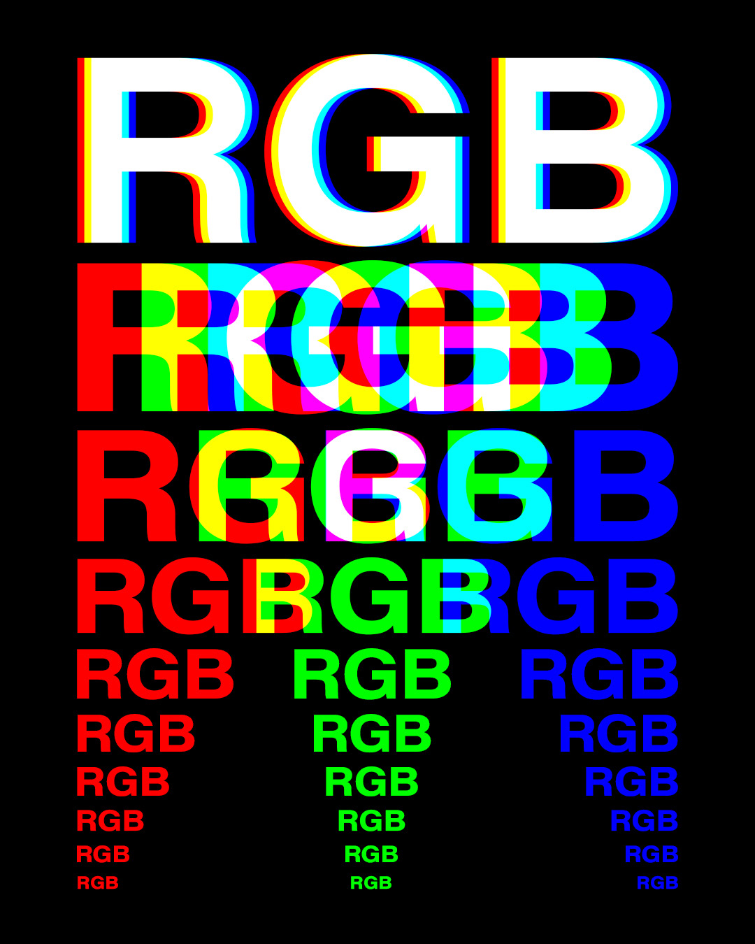
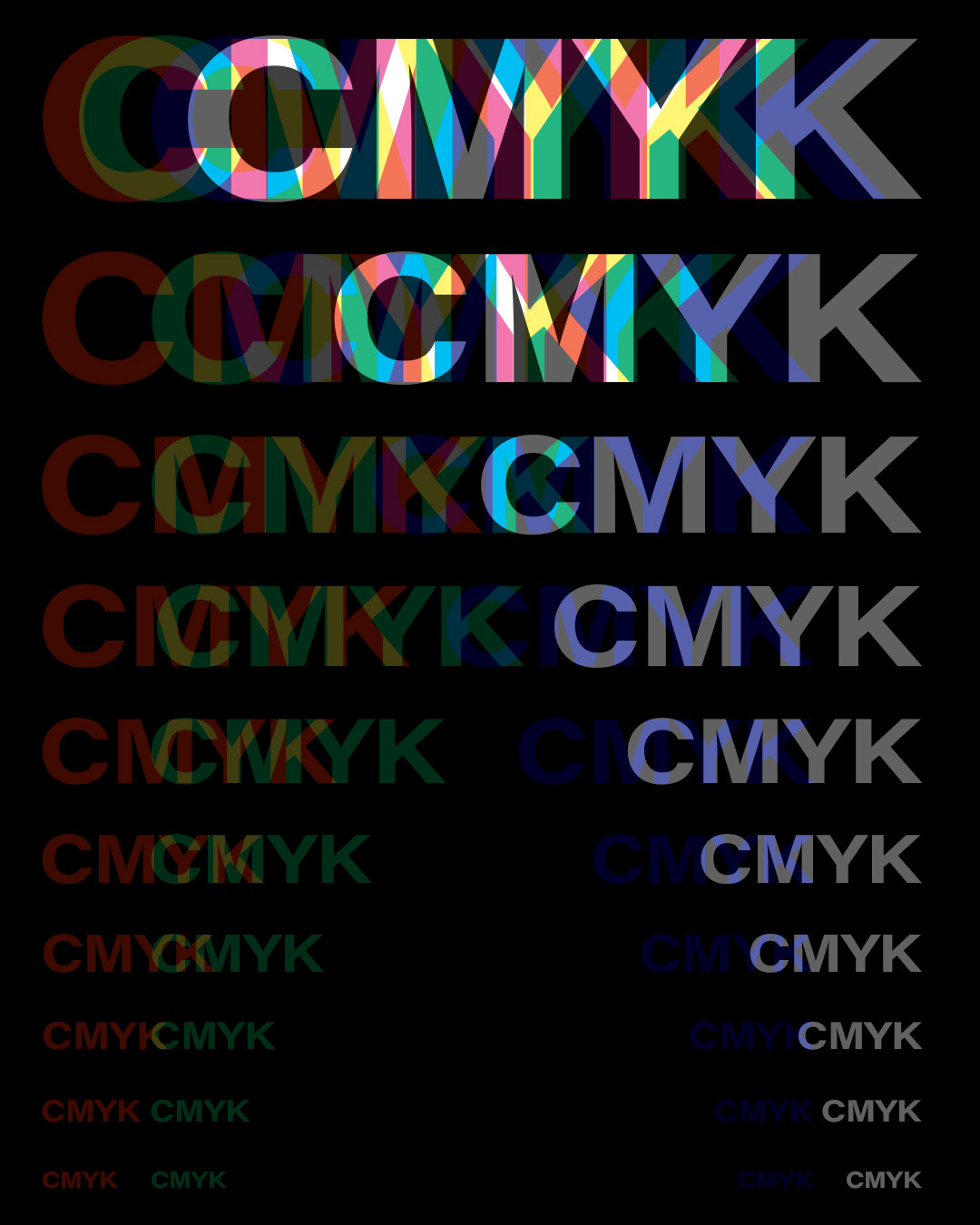
I thought of this idea when I was printing in the computer lab one day at The University of Minnesota in the College of Design, and overhearing an argument between some students about how their images should be in either RGB or CMYK for printing. The splitting was based on them going their separate ways with I assume one doing RGB and the other doing CMYK . I was also just interested to see how the basic colors of these color modes interacted based of a previous piece I did, QUOTES.
To make this, I went into Adobe Photoshop and made the size I wanted and made a black background. Next was finding a font, and I wanted one that was bold to see the overlap between all the letters. I ended up choosing Acumin Variable Concept and used the wide bold setting. Then the process became pretty repetitive where I would type out RGB or CMYK and figured out my scaling so interesting overlaps occurred as the font gets smaller moving down the image. For both effects I just changed the blending mode to screen, and depending on which column I was working on, that would be the channel I had kept checked in the layer styles panel. For example, the red column in RGB would have the green and blue channels check boxes unchecked reveling this bright red. In the CMYK version, this was the same with the only difference being that the document was made in CMYK to have these options show up instead of my regular mode of RGB.