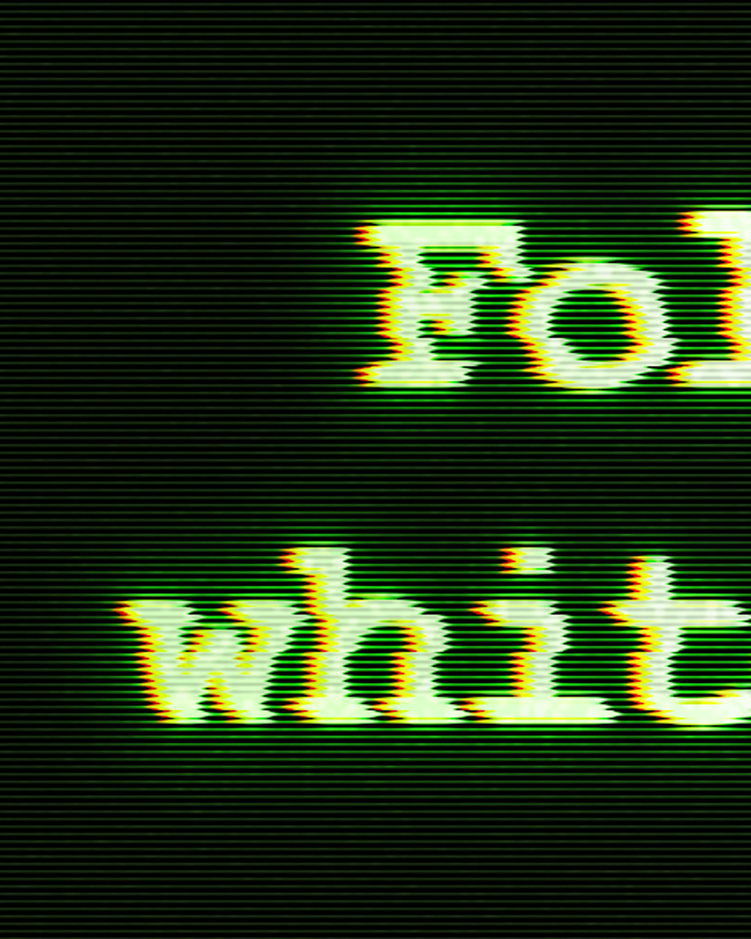
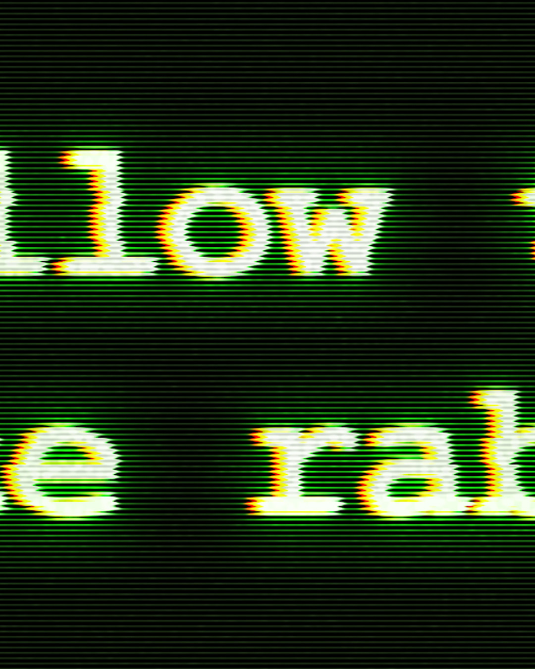
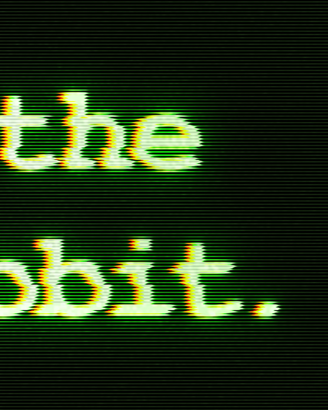
I was watching The Matrix the night before making this piece, and I thought to myself after watching this iconic scene in the movie, "I could make that screen relatively easy". And so here we are, and it was a little bit trickier to nail the retro kind of vibe.
To make the image, first step was nailing the font. I searched the internet for something I thought looked similar to the font that was used in the movie, and then I realized that was dumb. Most likely this wasn't a custom font, and it was a basic font that would already be on the computer. I settled on using Courier New as my font and made it bold. Next to get the crt screen look with the font, there needs to be a slight splitting of the RGB values. To do this I first placed the font where I wanted it and sized it accordingly, and then made two copies of this font layer. The first copy I nudged over a little bit and then in the layer style dialog box, I unchecked every channel except the green channel. The same was done with the second copy, but it was nudged a little more to the left and only the red channel was checked. Then the next step was to blur each layer with a slight gaussian blur, boom text locked down.
Next was the glow of the text in the screen. For this I just copied the green channel text copy twice and added different levels of gaussian blur. One being 10 px and the other being 35px to get this nice soft but still vibrant glow on the text.
Now to bring it all together, it's time to work on the background. The base color for the background is a deep dark green that is almost black (here is the hex code: 111a0d). Then it is time to add all the scan lines for the screen. You could make a bunch of rectangles in alternating black and white coloring, props to you if you do that...but I just used the filter gallery to make it real simple. I went to the filter gallery and selected the sketch group and used the halftone pattern, and I just changed the pattern to lines and messed with the sizing and spacing of them until it was to my liking. I then added a small gaussian blur to the layer so they weren't just perfect straight lines, and then copied this layer so I had two of these layers with all these lines. For the first one, it'll be the background so I changed the blending mode to vivid light. The second copy will be the lines on the text in the white areas, where I just changed the blending mode to subtract, which will get rid of the black bars, and reduced the opacity to 25%. Next I created a layer mask so this layer was just affecting the white text, and not the background.
The last little bit to add some more detail is to add a new layer and fill it with a nice neon green, and use a layer mask to add a slight glow on the outer edges. Then I merged all the layers into a new layer and nudged it over a little and used a layer mask to create the slight glitch in the text. Lastly I added some noise to make it a little less perfect and seem like an older image which would fit with the crt screen. I also have some larger images below that you can zoom in and see the detail.